Contents
Get the Free Bubble Chart Maker Template
If you have already grabbed your free copy of the perceptual map making Excel tool you will see that two of the map variations produced are in the form of bubble charts.
If you just need to make a bubble chart in Excel to demonstrate a relationship between two variables, then you can download and use this website’s free bubble chart Excel template.
This template is easy to use and is probably the simplest way to make a bubble chart. However, this template is just one of three possible approaches to making a bubble chart – to see all three, please see the YouTube video at the bottom of this page.
Click here to download the template…
What is a Bubble Chart in Excel?
Bubble charts (or graphs) are similar to scatter plot charts, as they are designed to identify and visually show the relationship between two variables.
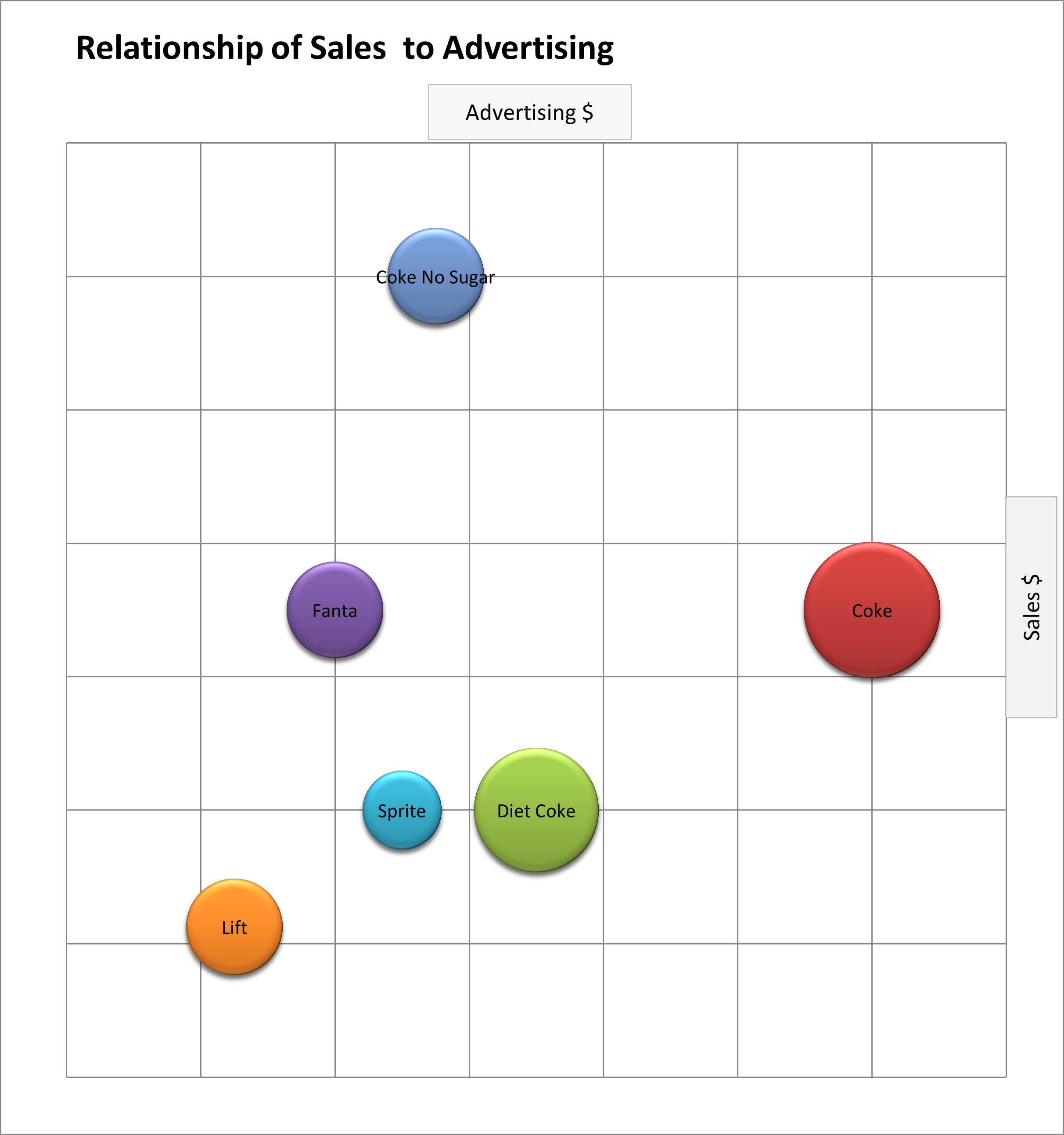
Take this bubble chart as an example. In this case, the total dollar sales of different brands of soft drink is graphed against estimated advertising spend. For these two marketing variables, you would expect to see a relationship, or what we normally refer to as a correlation.
A correlation occurs when the data on the graph seems to follow a pattern – that is, there is a co-relation between the two variables.
As you can see, except for Coke No Sugar, these brands (for sales and advertising spend) tend to fall in a straight line. This indicates that as one variable increases, so does the other one.
Logically, for this example, this relationship makes sense – as a greater level of advertising should normally result in higher sales volumes.
But Coke No Sugar is inconsistent with tis pattern = which we can assume has been given a larger advertising budget as it is a newer brand.
Free Excel Bubble Chart Template
The download link to help you make a bubble chart in Excel is available at the top of this page.
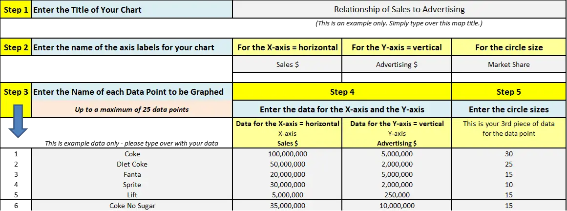
However, here is a screen shot of the input to the template to show you how easy bubble charts are to make. As you can see, this free template is very easy to use – even if you don’t normally use Excel.
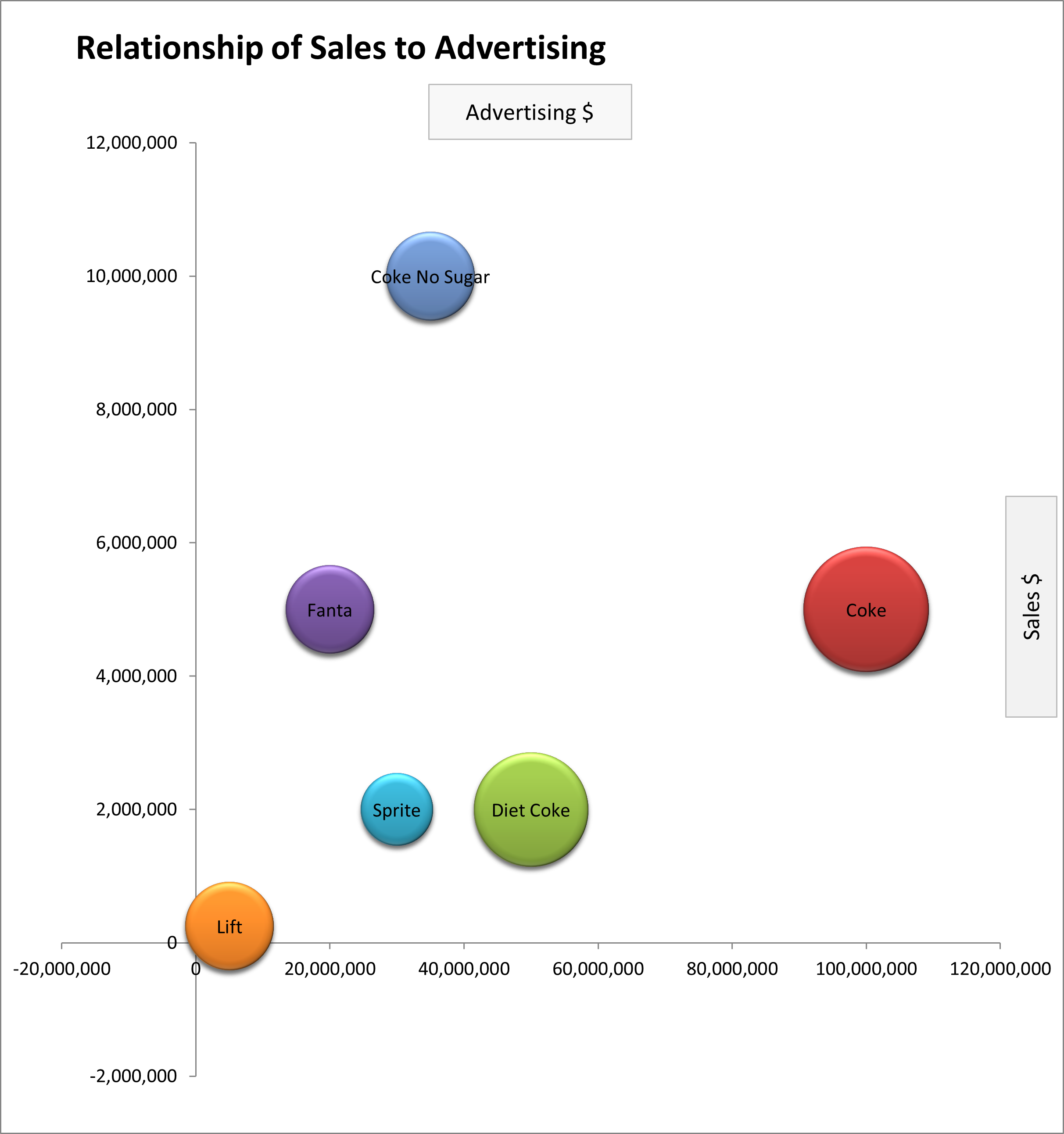
And in additional to the above bubble chart output (see previous example), this template automatically produces a second version of the bubble chart with the axis labels – as follows:
How to Make a Bubble Chart in Excel 365 (VIDEO)
Related Information
- How to Make a Perceptual Map in Excel 365
- How to Make a Perceptual Map in PowerPoint
- Using a Radar Chart as a Perceptual Map
List of the Perceptual Maps and Other Templates
- Perceptual map maker template (free)
- Multi-perceptual map maker (great for analysis, quickly makes multiple perceptual maps)
- Multi-dimensional (MDS) perceptual map template (free version)
- MDS perceptual mapping tool (small fee)
- Overall similarities gap map (a variation of a perceptual map)
- Customer journey map maker template (free)
- All The Free Perceptual Mapping Templates