Contents
What? A Radar Chart for Perceptual Mapping?
Yes – and it is a very effective mapping approach, especially where you have lots of brand (or product) attributes to consider. In this situation, using a radar chart as a perceptual map can be a great alternative to the traditional the traditional two axis perceptual map.
Generally this approach is NOT discussed in a marketing textbook, where the traditional discussion is on the more basic approach of a perceptual map – but we are marketers after all, and our job is be creative.
Radar Chart and Their Image Data Inputs
Radar charts look like spiderwebs. They are one of the “other charts” options in an Excel spreadsheet.
If you have positioning/image data that is quite complex will has not been analyzed previously, then a radar chart is a good place to start sorting through the data and is often a better approach than a traditional perceptual map.
Take this summary of positioning/image survey results as an example.
As you can see, there are 10 product attributes measured against 14 brands – that’s a total of 140 measures per year, for two years. That’s a lot of data to sort through to get a good sense of how the brands complete and how they are effectively positioned.
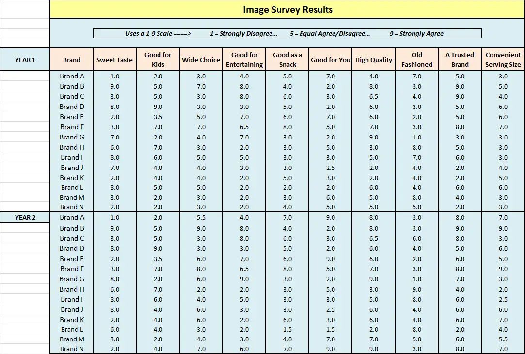
This is where radar chart comes in very handy to quickly summarize the data – note that there is a “how to” video at the end of this page that steps through how to construct a radar chart for perceptual mapping.
This first radar chart shows all 10 product attributes for the first three brands only .
This allows you to quickly compare the brands on all attributes at once, in order to get a sense of where they stand out and how they compete against each other, as well as get a good understanding of what the brand is about.

For instance, you should see that Brand B is a very sweet tasting cookie that offers a wide choice, is considered to be of high quality and is a very trusted brand. This is opposed to Brand A that is a not sweet (savory) product that is reasonably healthy, but is considered to be a little bit old-fashioned.
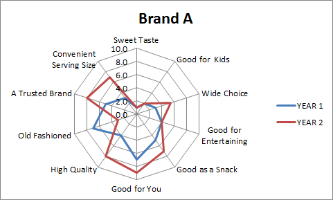
Showing Brand Development Over Time
Another advantage is called a radar chart is that can easily map how a brand is being developed over time and how the consumer’s perception of that product is changing.
This is shown in the second radar chart positioning map, where Brand A’s perceived product attributes and image elements are compared on a year-by-year basis.
As you can see this brand has significantly added to its serving size and choices, and is now being seen as more high quality healthier and more of a trusted brand. It is also reversed its old-fashioned image.
Key Tip for Using Radar Charts for Perceptual Mapping
- Try not to use more than four or five brands at the one time, otherwise the radar chart becomes far too cluttered and too difficult to read.
Make Your Own Radar Chart Perceptual Map in Excel
Find out how in these video instructions…
Related Tools and Information
- Free Download of the Perceptual Map Template
- Make 100s of Perceptual Maps Really Fast
- How to Make a Perceptual Map in PowerPoint
- What is a Perceptual Map?
- Lots of Example Perceptual Maps
Check Out Multi-Map Template
If you need to construct more than one perceptual map – which is the most common scenario – then you might be better off with the Fast Perceptual Map Maker.
This template allows the input of up to 25 attributes and up to 25 brands, which then enables you to review up to 300 perceptual maps amazingly fast. A great analysis tool.