Contents
Formatting Your Perceptual Map
Let’s have a look at how to reformat your perceptual map. To help you get started, the free template already produces four different designs – so you can pick and choose the map that best suits your presentation needs. You can review the designs here: Four Perceptual Map Designs
Don’t have the free Excel perceptual map tool yet? Take me to the download page: Free Download of the Perceptual Map Template
Formatting Tips
If you want to modify and redesign the perceptual map in the Excel template, then please follow these redesign instructions.
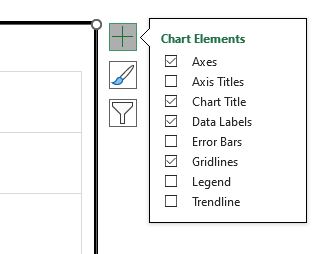
To Remove Gridlines
Click on the map and click the big plus button (+) to the right. A new menu pops up – and then deselect gridlines, as per the image below.
To Change Colors of the Circles/Bubbles
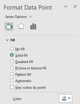
To change ALL circles/bubble to the same color, click on any bubble ONCE. To change the color of ONE circle/bubble only, click on that bubble TWICE.
This will bring the Format Data Point menu to the right hand side. Click the paint can icon, then Solid Fill (or other choice), then select your required color – as per the below image.
To Change Bubble/Circle Sizes
If you want to adjust relative sizes – then use the Circle Size input (Step 6 on the template on the INPUT YOUR DATA tab).
However, if you want to make ALL bubbles bigger or smaller, then you need to:
- Click on any circle top highlight it
- Right click to bring up the ‘Format Data Series’ menu
- In the menu (pops up to the right), enter a value in ‘Scale bubble size’
Note: You may want to have different circle/bubble sizes to reflect:
- The brand’s market share
- To highlight your brand
- The current versus prior position of the brands
To Add Market Segments
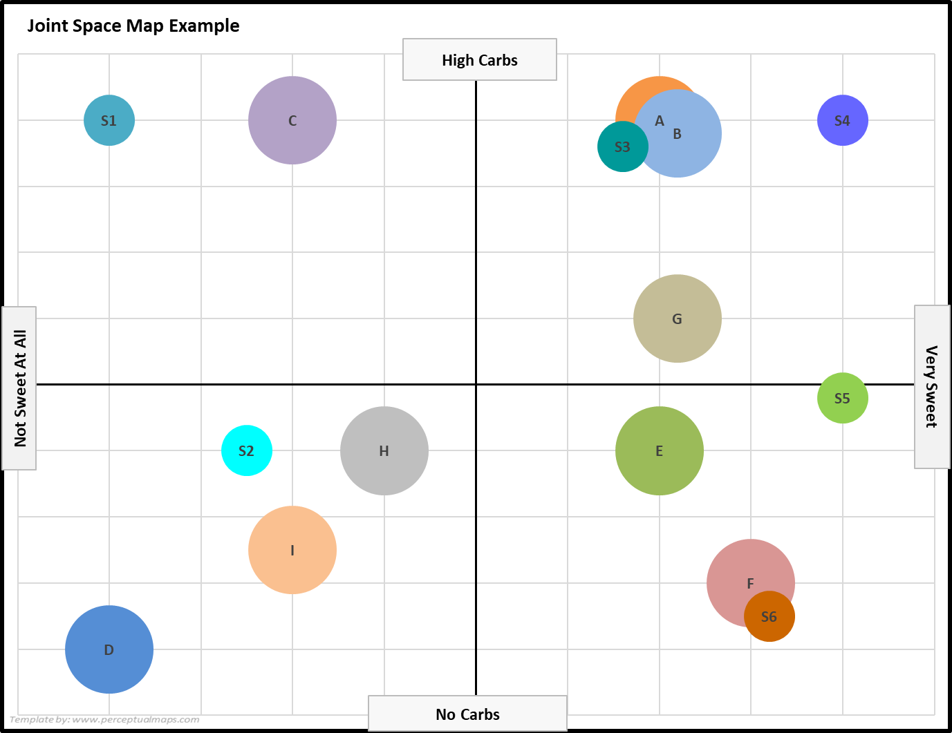
A quite effective way of understanding product positioning is by placing the brands AND the preferred needs of the various market segments onto the same perceptual maps.
This type of map is known as a joint space perceptual map, because brands and market needs are jointly shown in the same map – and there is an example of this type of map below.
To create a joint space map, enter the ideal consumer preference score (for each attribute) the same way that you would enter a brand, but instead, label it as a market segment -0 see below, segments = S1, S2, etc.
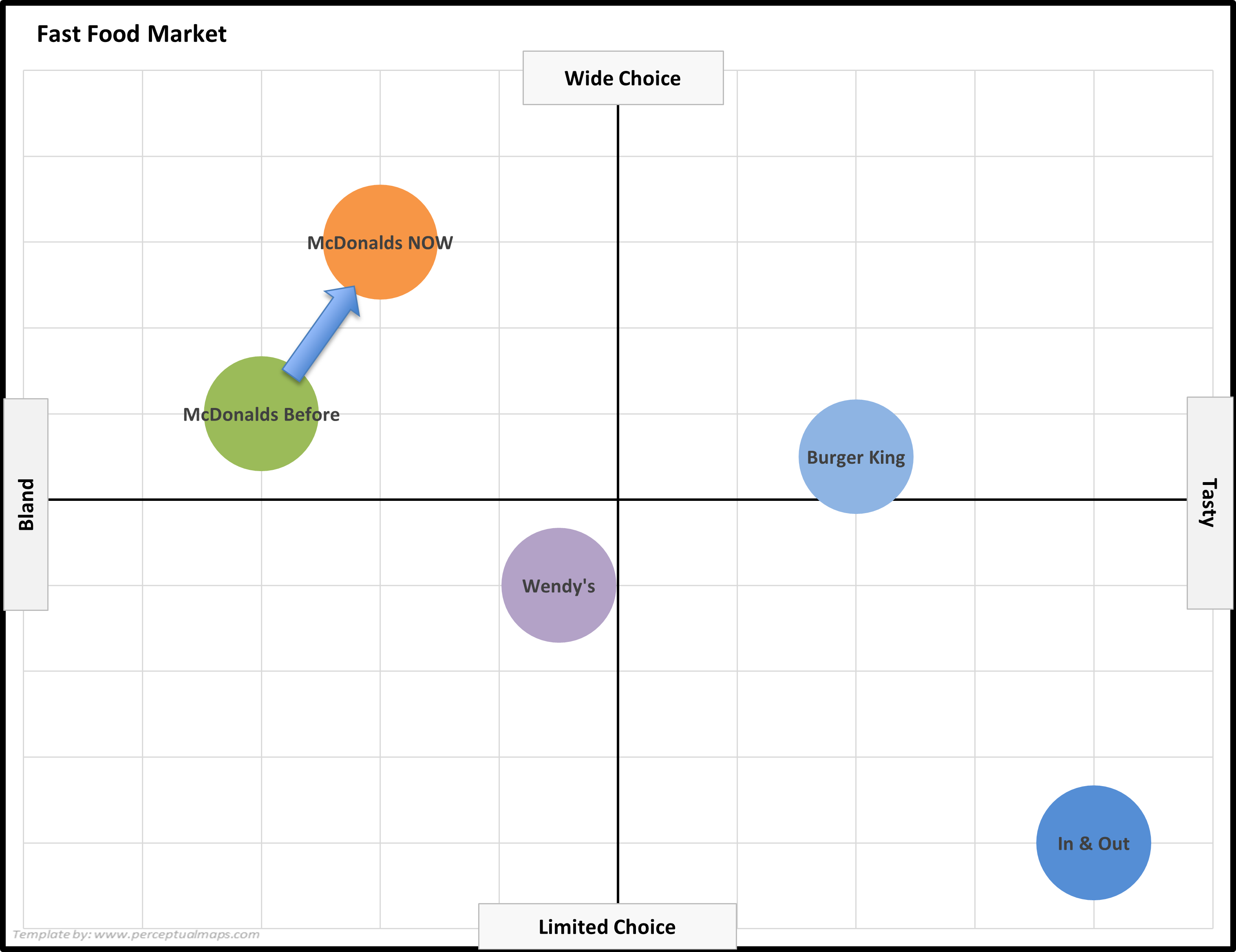
To Show Repositioning (or Time Changes) on a Perceptual Map
This Excel template can very useful for showing how brands have been (or are planned to be) repositioned, as shown in the following example perceptual map for fast food.
To set up a repositioning style map, firstly enter brand with a time code (e.g. ‘Before’, ‘Last Year’) – this will produce the circles on the map as usual.
Then click on the map to select it – then insert an arrow shape onto the map – and then drag it to the required position, as shown in the following map.
Need Mapping Help?
I hope that you find the spreadsheet templates easy to use, as well as being a big time-saver. If you have any questions, you can email me.
Or I can design a template for you – email me for a quote. Email = geoff@perceptualmaps.com
MORE PERCEPTUAL MAPS INFORMATION
- A free Excel spreadsheet template to easily make perceptual maps
- Lots of ideas for the attributes to use on your map
- Information on how to use perceptual maps in developing marketing strategy and positioning
- As well as understanding what is meant by a determinant attribute
- How you can use perceptual maps to define competitive sets
- Discussion of the different types of perceptual maps
- Simple instructions on how to format maps in color
- How to make a perceptual map in Excel 365
- How to make a perceptual map in PowerPoint
- A free template to make a brand association map in Excel
- A free Excel template to make a multidimensional perceptual map
- A free customer journey map template
- And, if needed, a free Excel template to make overall similarity (OS) perceptual maps
