Contents
- 1 Let’s Make a Perceptual Map in Excel 365
- 2 Making a Map in 365: Overview of the Key Steps
- 2.1 Step 1 = Preparing your consumer perception data
- 2.2 Step 2 = Inserting your Excel chart (graph/map)
- 2.3 Step 3 = Set chart title
- 2.4 Step 4 = Remove gridlines = optional step
- 2.5 Step 5 = Set and design axes on the perceptual map
- 2.6 Step 6 = Set data labels
- 2.7 Step 7 = Scale bubble sizes
- 2.8 Step 8 = Add axes labels
- 2.9 Step 9 = Play with format = optional
- 2.10 Step 10 = Copy/paste
- 2.11 Get the Free Excel Perceptual Map Template
- 3 Perceptual Maps 4 Marketing
Let’s Make a Perceptual Map in Excel 365
Perceptual maps are powerful, yet simple, tools to demonstrate the competitive positioning of brands and companies. The most commonly used type of perceptual map is a two-axis map, which is usually presented using either Excel’s bubble chart or scatterplot chart.
Unfortunately, while charts in Excel are normally quite straightforward, the formatting of a perceptual map requires somewhat of a manual set up.
Below are the instructions for presenting a perceptual map in Excel, using Office 365
OR you can download the easy-to-use perceptual mapping template Free Download of the Perceptual Map Template
Let’s first check in: What are we trying to do with our image data?
A perceptual map is a visual representation of consumer perceptions of the image (attributes, features, products, benefits) of competing brands in a marketplace.
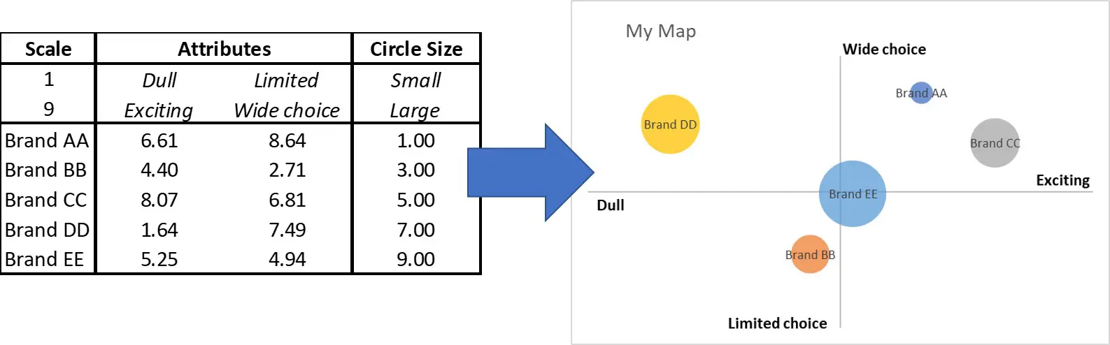
This means that we want to turn this table of consumer perceptual data into this perceptual map, as shown in the following example. As you can see, the consumer scores for these two attributes (dull to exciting and limited to wide choice) have been converted to a visual map = a perceptual map, as it maps perceptions.
If that’s what you are wanting to do you can either review the instructional video or scroll down for the written steps and images.
Making a Map in 365: Overview of the Key Steps
We will now cover the main steps in the formatting of a perceptual map, as follows:
- Step 1 = Have you image data ready and correctly formatted
- Step 2 = Insert a bubble chart in the 365 Excel menu
- Step 3 = Set chart title
- Step 4 = Remove gridlines
- Step 5 = Set and design axes
-
- Set minimum and maximum value
- Set intercepts to run through the middle
- Remove numbers and labels
- Step 6 = Set data labels
- Step 7 = Scale bubble sizes
- Step 8 = Add axes labels
- Step 9 = Play with format
Step 1 = Preparing your consumer perception data
Perceptual map data needs to be in a consistent scale. Typically, the data is obtained from a customer image/perception survey, where the customer is asked to rate brands against specific attributes on a numeric or a agree/disagree scale.
Therefore, in most cases, the data is already in a suitable format – but please ensure that the same scale is used for each brand or product attribute.
If you intend to have the circles (on a bubble chart) to be different sizes, you will also need to add a column for the circle size – but this is optional. In Excel, circle sizes are relative to each other, so the larger the differences here, the larger the differences in the final circles.
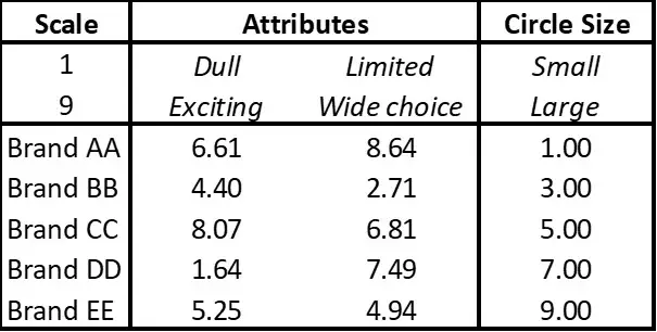
Looking at the below table, you can see that the data is effectively presented using a 1-9 scale. There is a list of the brands/firms, along with the two attributes for the map and their scores, and the circle size required for each brand.
To recap, in the data set up we need:
- Brand or product names (or codes)
- Image scores for at least two brand/product attributes
- These brand/product attributes need to structed as opposites (e.g. hard v soft, cool v nerdy)
- All the attributes scores need to be in the same data scale
- And you may add optional circle sizes
Step 2 = Inserting your Excel chart (graph/map)
Drag your mouse over the perceptual data that you plan to map.
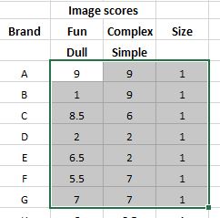
Do NOT include the brand/product names. Just highlight your data. An example is shown below. If you not have circle sizes, just add 1 for each brand (also as shown below).
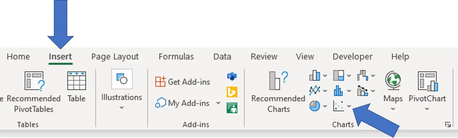
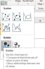
Then click on “insert” in the top menu on Excel, and then go across and click on the bubble chart icon, as shown in the following image. Then click on the bubble chart, as shown in the underneath image, but you can also use a scatter chart if required.
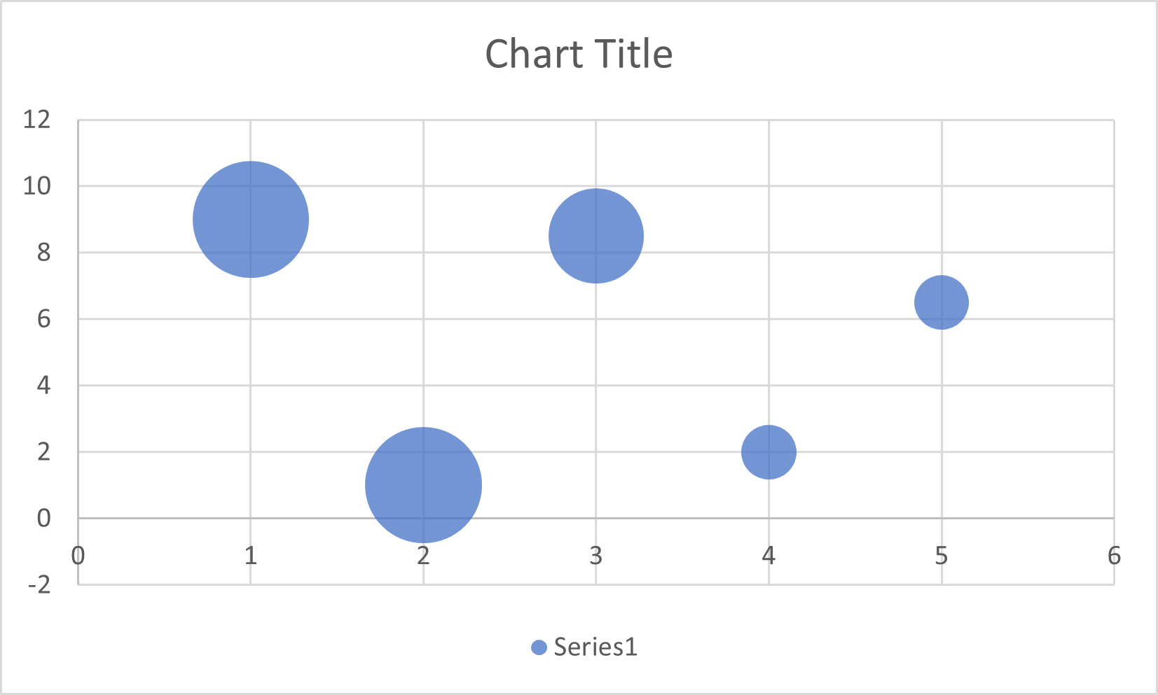
Please note that a unformatted (map) chart will be inserted into your spreadsheet, so don’t worry as we will format and design it in the next steps. At this stage, it should look something like this draft map…
Quick check of your map’s data
Now is a good time to check that the data for the chart has been constructed and selected correctly.
To do this you simply pop your mouse over each of the bubbles/circles and the data points and circle size information for that bubble will be displayed automatically and you can quickly check against your data table to ensure that you have not accidentally selected the wrong cells.
Step 3 = Set chart title
As you can see above, the unformatted perceptual map simply has “chart title” as its heading. You need to rename this to reflect the name of your perceptual map.
To do this, simply click on where it says chart title and retype the name of your perceptual map.
Step 4 = Remove gridlines = optional step
Depending upon your desired presentation for your perceptual map, you may decide to include or remove the gridlines on the map.
Traditionally, in most marketing textbooks, perceptual maps have been presented without gridlines. However, the addition of gridlines (without numbers) allows for easier comparisons between brand positions when viewing the map.
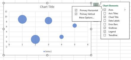
To remove the gridlines – highlight the chart and press the plus button (+) that will appear in the top right hand side of the map. When you click the plus button, a menu will appear.
And one of the options on this menu is “gridlines” which you can select or deselect depending upon your presentation and formatting preferences.
Step 5 = Set and design axes on the perceptual map
As you most likely know, perceptual maps are normally presented without numbers and their axes run through the center of the map – creating a matrix looking chart. This means that we will need to reformat our draft perceptual map that is shown above.
Again, we highlight/select the map/chart to bring out the plus button (+). This time when we click on the plus button, we select the little triangle symbol to the right of “axes” – which will bring up a new (second) menu, as shown below.
And we want to click on “More Options”.
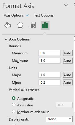
When you click on More Options, this will bring up the Format Axis menu on the right hand side of your spreadsheet – as shown below…
Let’s now work through what we need to change in this menu, which includes:
- Set minimum and maximum values
- Set intercepts to run through the middle
- Remove numbers and labels
Set minimum and maximum values
In the first boxes, you can see that the Bounds of minimum/maximum scores can be entered.
You should set the minimum and maximum bounds of the axis to be one more than the scale that you’re using.
For example, if you are using a 1-9 scale, the bounds should be set at 0 and 10. However, if you are using a 1-5 scale, then you should set the bounds at 0 and 6. This will ensure that your circle/bubbles will always fit neatly into the edges of your perceptual map.
Set intercepts to run through the middle
Now we want to set the axis intercepts to run through the middle – to create the matrix looking perceptual map design.
In the above Format Axis menu, you can see that there is an option to select axis value data near the bottom (under Vertical axis crosses).
You need to set this number as the midpoint of the scale that you are using. For example, 5 is the midpoint of a 1-9 scale and 3 is the midpoint of a 1-5 data scale. You may need to select a different midpoint depending upon the scale that you are using.
We now need to REPEAT this process for the other (horizontal or vertical) axis as well. To access the other axis to format, click on the downward triangle shape next to Axis Options right at the top – this will bring up a menu to allow you to access the other axis that needs formatting.
At this stage, you will have a perceptual map that looks something s like this. As we can see, the axis running through the middle – I had kept gridlines in – but there are numbers populating the chart that we now need to remove.
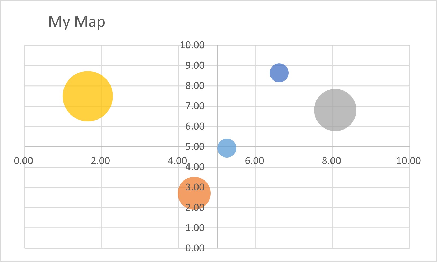
Remove numbers and labels
To do this, we need to edit the Tick Marks And Labels – at the bottom of this next image – and ensure that both are set to None. And we need to do this for both the horizontal and the vertical axes.
![]()
Step 6 = Set data labels
In most cases, we will want the brand (or product) name listed in the center of the circle/bubble.
Again, we highlight the map and then click on the plus button (+) and click on the right triangle shape next to Data Labels. This will bring up a submenu, where we click on More Options, and this menu will appear:
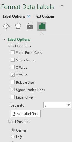
We now need to select Value from Cells. A new box will pop up asking you to select your data label range. While this box is open, drag your mouse over your Brand Names and then click OK.
You now need to deselect/uncheck Y values and leader lines – so that only Value from Cells has been selected. Then scroll down that same menu and set the Label Position to Center. Your brand names will now appear in the center of the circles.
Step 7 = Scale bubble sizes
As an optional step, you can choose to scale the size of the bubbles. To change the relative size between them, remember that you have added circle sizes in your data set. Therefore, by making these larger or smaller, the bubble sizes will rescale on a relative basis.
However, if you want to make ALL bubbles bigger or smaller, then you need to:
- Click on any circle top highlight it
- Right click to bring up ‘Format Data Series’
- In the menu (pops up to the right), enter a value in ‘Scale bubble size’
Step 8 = Add axes labels
The next step in the formatting of our perceptual map is to add the attribute labels. There are two ways to do this:
- We click on the chart first and then insert a text box. In the text box, we type in the name of one end of the attribute and position (drag) the text box at the appropriate end of the axis.
- We click on the chart first and then insert a text box. We then go to the fx (function box above) and type “=” (the equal sign) and then click on the cell where the attribute is listed. This allows us to create more of an interactive map. We then need to position (drag) the text box at the appropriate end of the axis.
Note: We then repeat this axis end naming process for the other three attributes.
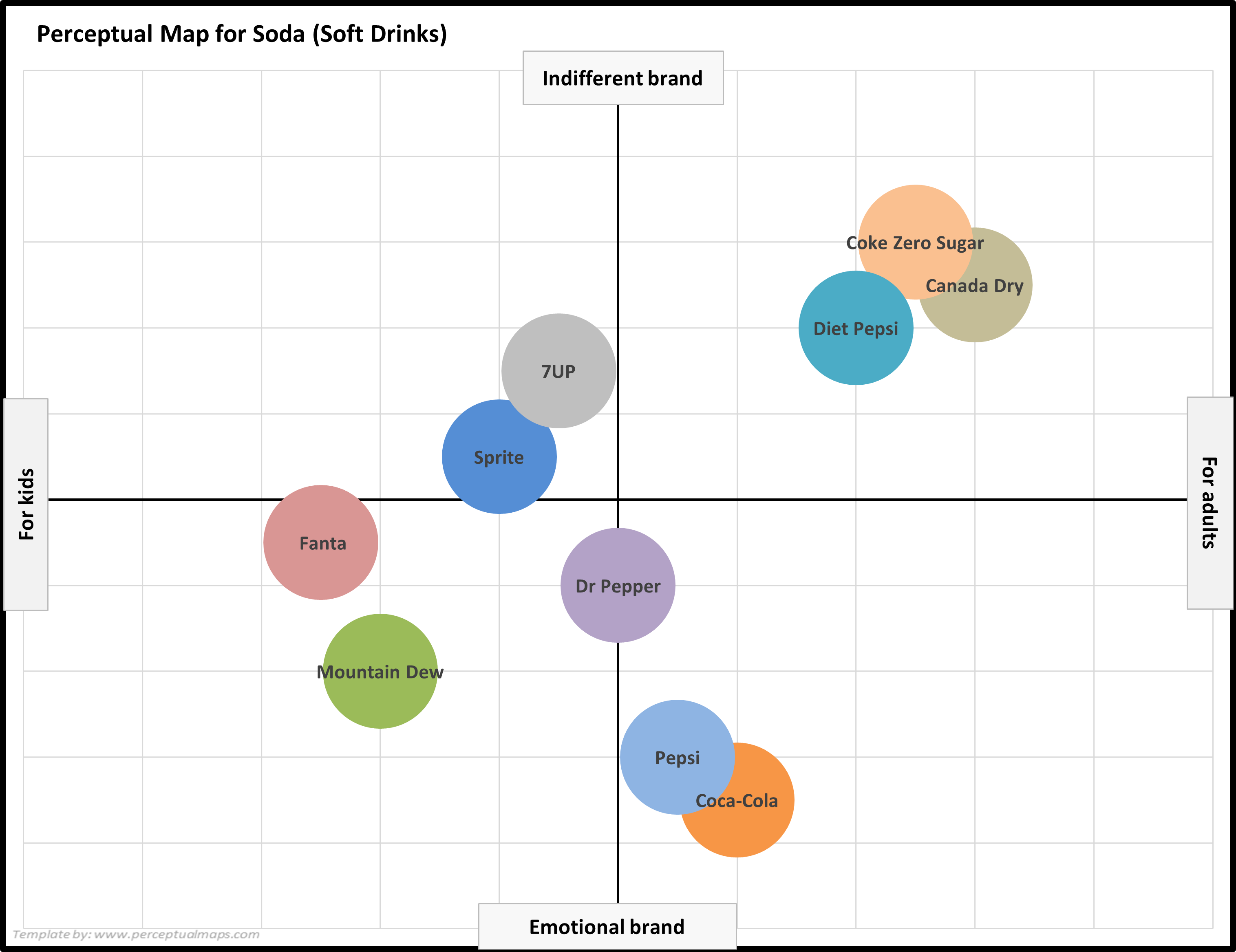
You final perceptual map should now look something like this one, which includes:
- A clear chart title for the perceptual map
- Brand names appropriately positioned inside the circles
- The circles/bubbles position being reflective of the consumer perceptions and image data
- The axis clearly labeled at each end
- And gridlines if required
Step 9 = Play with format = optional
You may wish to change colors of the map, circle sizes, and so on at this stage – to slightly modify the look and design of your perceptual map.
Please note this is an optional step and provided you have followed the perceptual map instructions listed above for Excel 365 or have watched the instructional video – your perceptual map should be now complete.
Step 10 = Copy/paste
In most cases you will want your perceptual map to be copied/pasted into a document or presentation.
To do this, click on the edge of the chart and select copy – but remember to paste it as a PICTURE, as this will protect the formatting of the map.
Get the Free Excel Perceptual Map Template
To save you from working through the above steps, there is a free Excel Perceptual Map maker available on Perceptual Maps 4 Marketing.
MORE INFORMATION
- How to Format a Perceptual Map
- Get the Most Out of Your Perceptual Maps
- Perceptual Maps: Best Practice
- Top 12 Tips for Analyzing Perceptual Maps
PERCEPTUAL MAP EXAMPLES
- Example Perceptual Maps for Breakfast Cereals
- Example Perceptual Maps for Streaming Services
- Example Perceptual Maps for Restaurants
- Example Perceptual Maps for Smart Phones
- Example Perceptual Maps for Soda (Soft Drinks)
- Example Perceptual Maps for Candy Bars
- Example Perceptual Maps for Fast Food
- Example Perceptual Maps for a Coffee Shop
- Example Perceptual Maps for Retailers
Perceptual Maps 4 Marketing
- The Home of the Free Perceptual Map Excel Template
- Downloaded over 100,000 times since 2013
- Always free, always will be
- Ideal tool for marketing students, analysts, and practitioners
Take me to the download page: Free Download of the Perceptual Map Template