Contents
- 1 Difference Between Multi-Dimensional Scaling Maps and Correspondence Analysis Maps?
- 1.1 The Six Key Differences Between MDS and CA Maps
- 1.1.1 The MDS Map Output
- 1.1.2 Key Difference 1 = Correspondence Analysis Looks at Relative Differences and Multi-dimensional Scaling Looks at Absolute Differences
- 1.1.3 Key Difference 2 = Correspondence Analysis Uses Angles and Multi-dimensional Scaling Uses Distance
- 1.1.4 Key Difference 3 = How to Identify Key Aspects of the Brand’s Positioning
- 1.1.5 Key Difference 4 = How to Understand Brand Strengths
- 1.1.6 Key Difference 5 = Two-axis Chart versus No Axes at All
- 1.1.7 Key Difference 6 = Consistent vs Inconsistent Map Outputs
- 1.1.8 MDS vs CA Maps FAQs
- 1.1 The Six Key Differences Between MDS and CA Maps
Difference Between Multi-Dimensional Scaling Maps and Correspondence Analysis Maps?
MDS mapping and correspondence analysis mapping are both analytical and visual techniques for understanding brand positioning and brand distinctiveness.
Although, at first glance their map outputs appear to be similar – as they both product maps with brands and product attributes scattered about – the way that these maps are reviewed, analyzed, and interpreted is QUITE different.
In this article, we will explore the key differences between MDS maps and correspondence analysis maps. You can scroll down for the full article, or review this summary video.
The Six Key Differences Between MDS and CA Maps
The best way to discuss how MDS mapping and correspondence analysis mapping differs is by using a worked example. Here is the data that we’re going to be using.
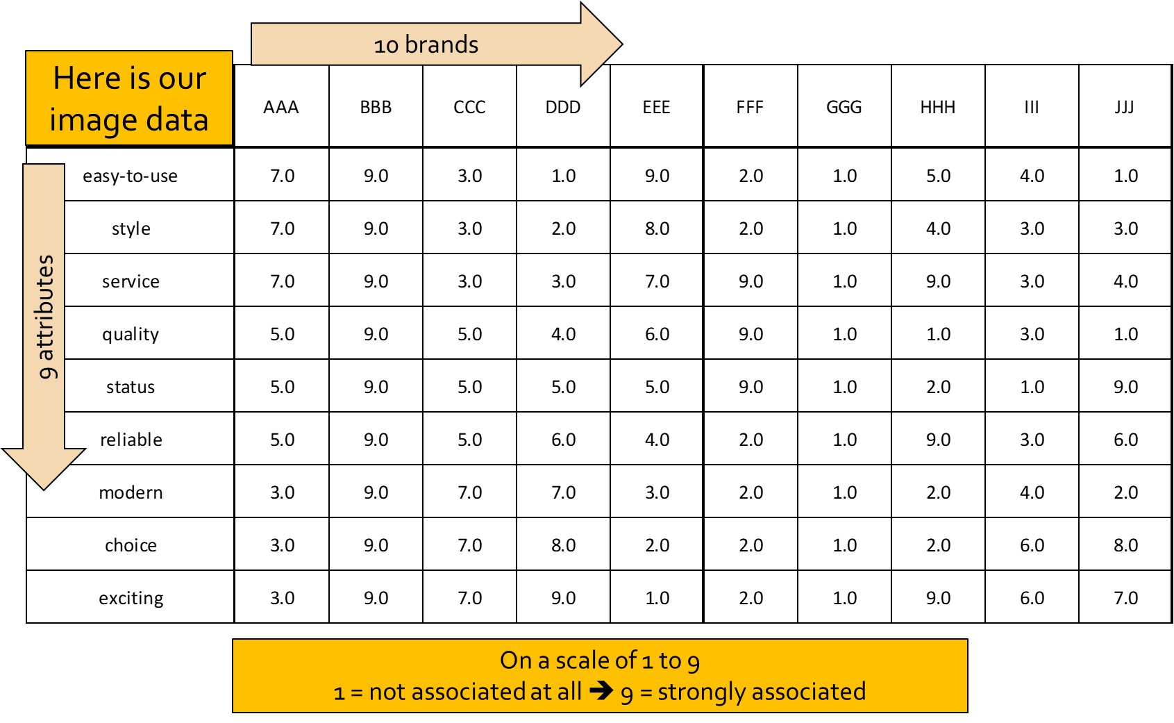
How the Image Data Works
As you can see:
- we have 10 brands, which I’ve just labeled them by letters (AAA, BBB, etc.)
- we have nine attributes (easy-to-use, style, etc.)
The data is scored on a scale of 1 to 9, as follows:
- 1 = not associated at all
- 9 = very strongly related between the brand and the attribute
Just a few quick examples to make sense of the data before we dive in. This is because I have purposely constructed the data to clearly highlight how these two perceptual mapping techniques differ.
- Brand B scored 9 out of 9 for everything (which is unlikely, but I’m showing it to see how it fits on a map)
- Brand G scores 1 on every attribute, so it’s the worst brand in the marketplace
- Brands A and C are opposites = they’ve got 7-3, then 5-5, then 3-7 scores – but in reverse order
- Brand D runs from 1 to 9, while Brand E runs from 9 to 1, so they are opposites as well
- Brands A and E are similar in perception and pattern, as they are both high in the first attribute and then their scores step down progressively
- Brands F, H, and J have some good points, some 9’s, but then generally not so strong on the rest
- Brand I is a mid-range brand that only scores 6, so it has no distinctive strengths
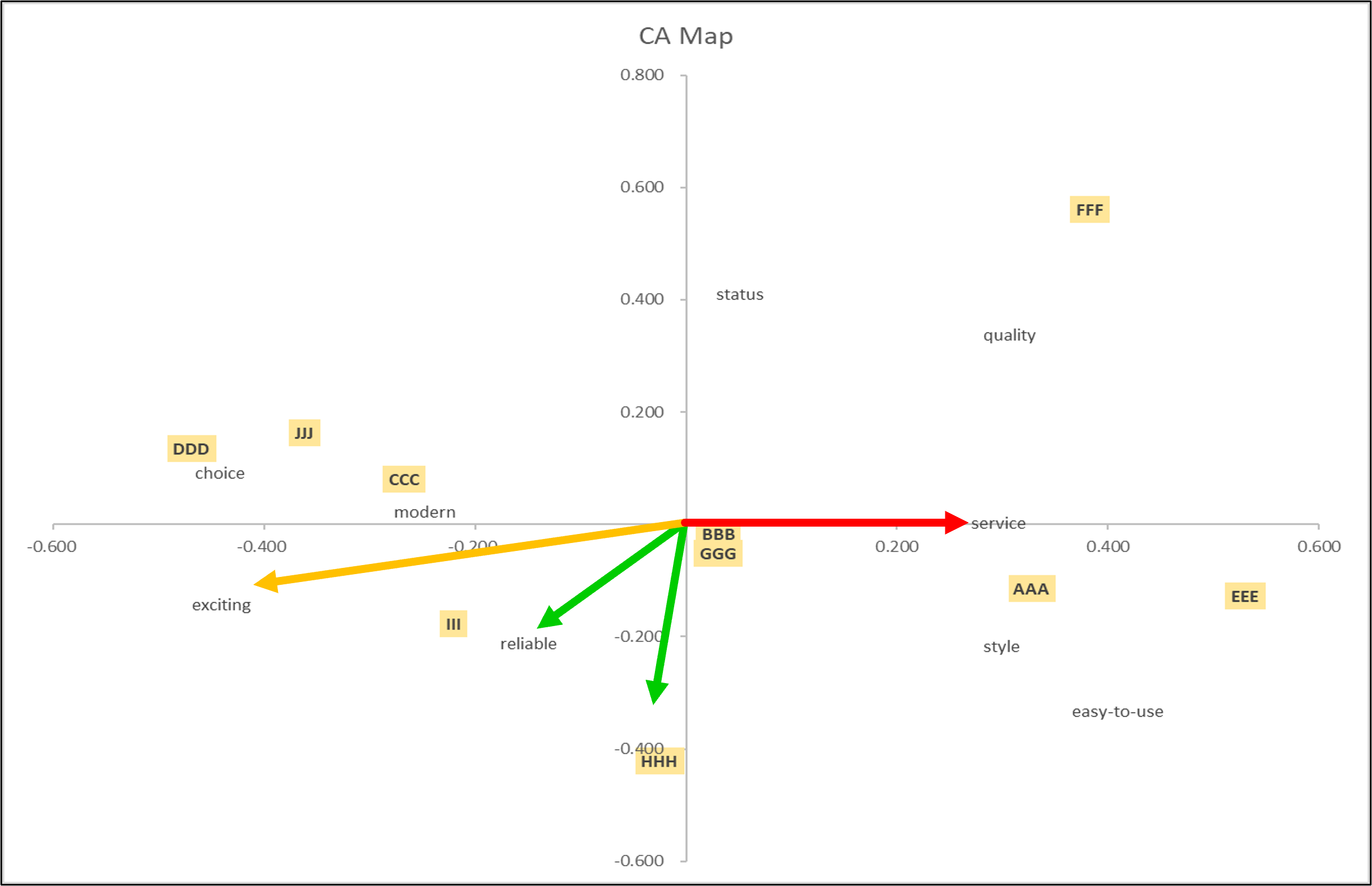
The Correspondence Analysis Map Output
When we run this data, this is our correspondence analysis map output. But please note that Brands BBB and GGG were mapped right on top of each other – they are identical on a CA map – so I moved GGG down slightly. And Brand DDD mapped on top of “choice”, so I just moved DDD up slightly as well (to aid the map’s readability).
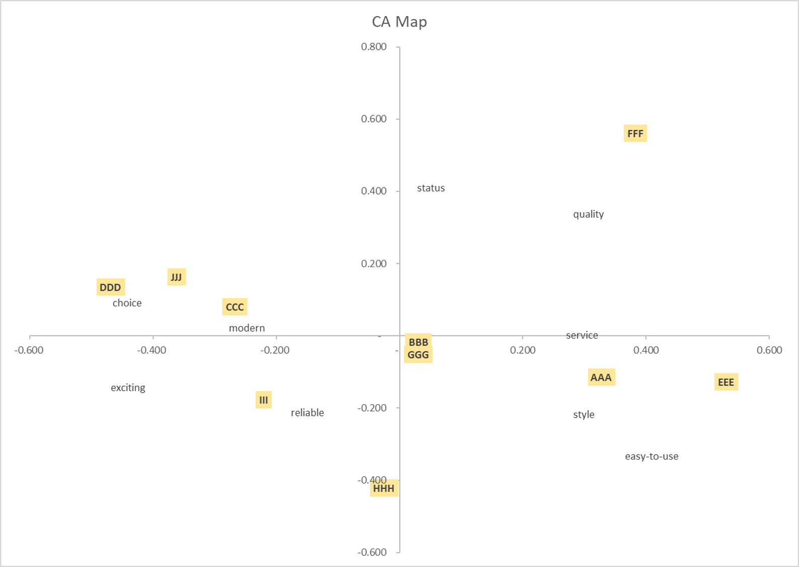
As we can see, there are two axes (or factors) with measures. Correspondence analysis produces scores for these two factors. In this example, our factor 1 and 2 scores total 74, which means that the configuration of this map has 74% accuracy, as compared to the market (with the remaining 26% explained by other sets of related brand attributes).
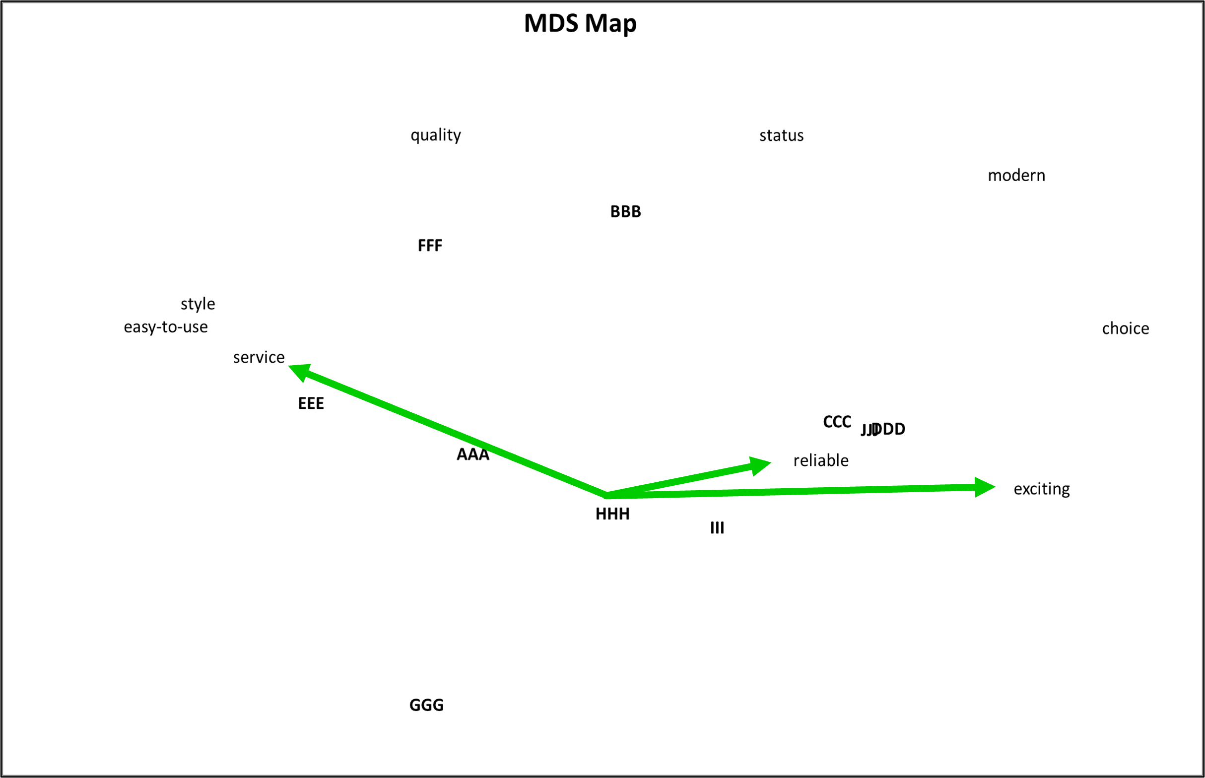
The MDS Map Output
And here is our multi-dimensional scaled perceptual map, which has a correlation score of 79. This means that 79% of the map’s output is consistent with the input image data – so both maps are similar in their representation of the consumer’s view of the brands in the market.
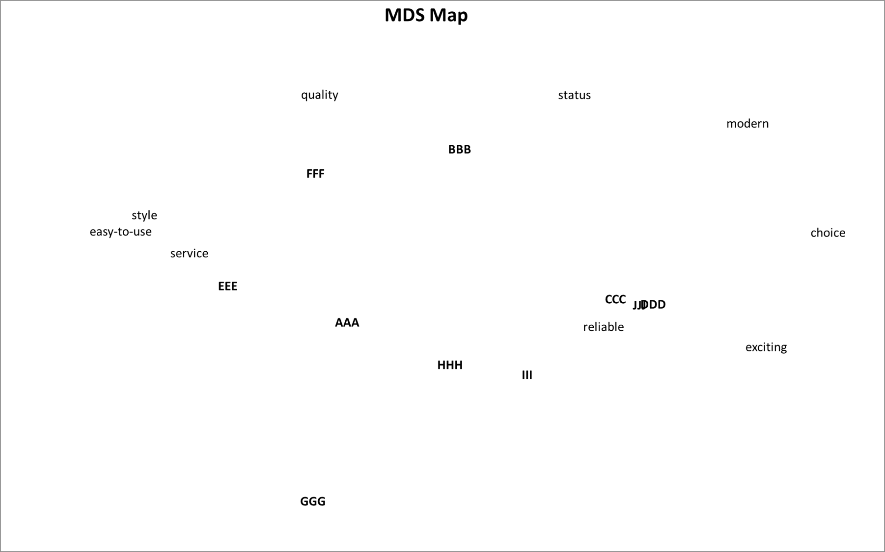
Let’s have a quick look at how we would read the above MDS map. In simple terms, multi-dimensional scale maps try to visually represent the relationships between different brands and their attributes – just like a geography map or atlas.
So when you look at an MDS map, you will notice that brands with similar attributes tend to cluster together. In the above example, Brands CCC, DDD, and JJJ are grouped together because (according to consumer perceptions) they share similar qualities.
Likewise, Brands III and HHH are clustered somewhat together because they have similar perceived attributes. This pattern shows each brand’s direct competitive sets.
In addition, the attributes on the map are either clustered together, or spread apart – again giving us some insight into their perceived relationship from a consumer’s perspective.
For instance, you can see that the attributes of easy to use, style, and service are grouped together on the map – which means that consumer’s interconnected these attributes in their perceptions.
While similarities in MDS maps are essential, differences are equally important. You will notice that some brands are be mapped closer or further away from certain attributes than others. For example, Brand III is mapped close to reliable, but well away from modern and quality. The closer the attribute to the brand – the stronger the direct connection in the consumers’ minds.
As a quick point before we go through the key differences, you should note that Brands BBB and GGG were mapped identically on the correspondence analysis map, but are mapped as complete opposites on this MDS map. And that’s why it is important to know how to read these two types of perceptual maps – let’s go through those differences now.
Key Difference 1 = Correspondence Analysis Looks at Relative Differences and Multi-dimensional Scaling Looks at Absolute Differences
The first major difference between these two methods is how they compare the differences between brands, attributes, and brand to attributes relationships. Correspondence analysis examines relative differences between things, while multi-dimensional scaling looks at absolute differences.
For instance, if we compare Brand BBB (which scored 9 out of 9 on EVERY attribute) and Brand GGG (which scored 1 out of 9 on every attribute). This makes these two brands complete opposites. You would think that on all perceptual maps that they should sit well away from each other on opposite sides of the map.
Yes, this is true for the MDS map, where we look at absolute difference. On MDS maps, “opposite” brands will always sit well apart and be visualized as quite different.
But NOT for correspondence analysis maps (see above) – where they sit together. Why are they considered the same in CA maps? Because correspondence analysis is designed to identified strengths and weaknesses in the brand, as compared to the average brand.
But for both of these brands, there are no apparent strengths or weaknesses because their scores were the same for ALL attributes, as follows:
- Brand BBB = 9/9 on every attribute
- Brand GGG = 1/1 on every attribute
So when the analysis tries to find their distinguishing attributes – it can’t find any – because their scores are the same for every single attribute. While this is unlikely to occur from a consumer image survey, it is a helpful way of understanding the different approach used when plotting maps.
Key Difference 2 = Correspondence Analysis Uses Angles and Multi-dimensional Scaling Uses Distance
The second major difference is that correspondence analysis relies angles from the center, while multi-dimensional scaling reads distances between brands and attributes.
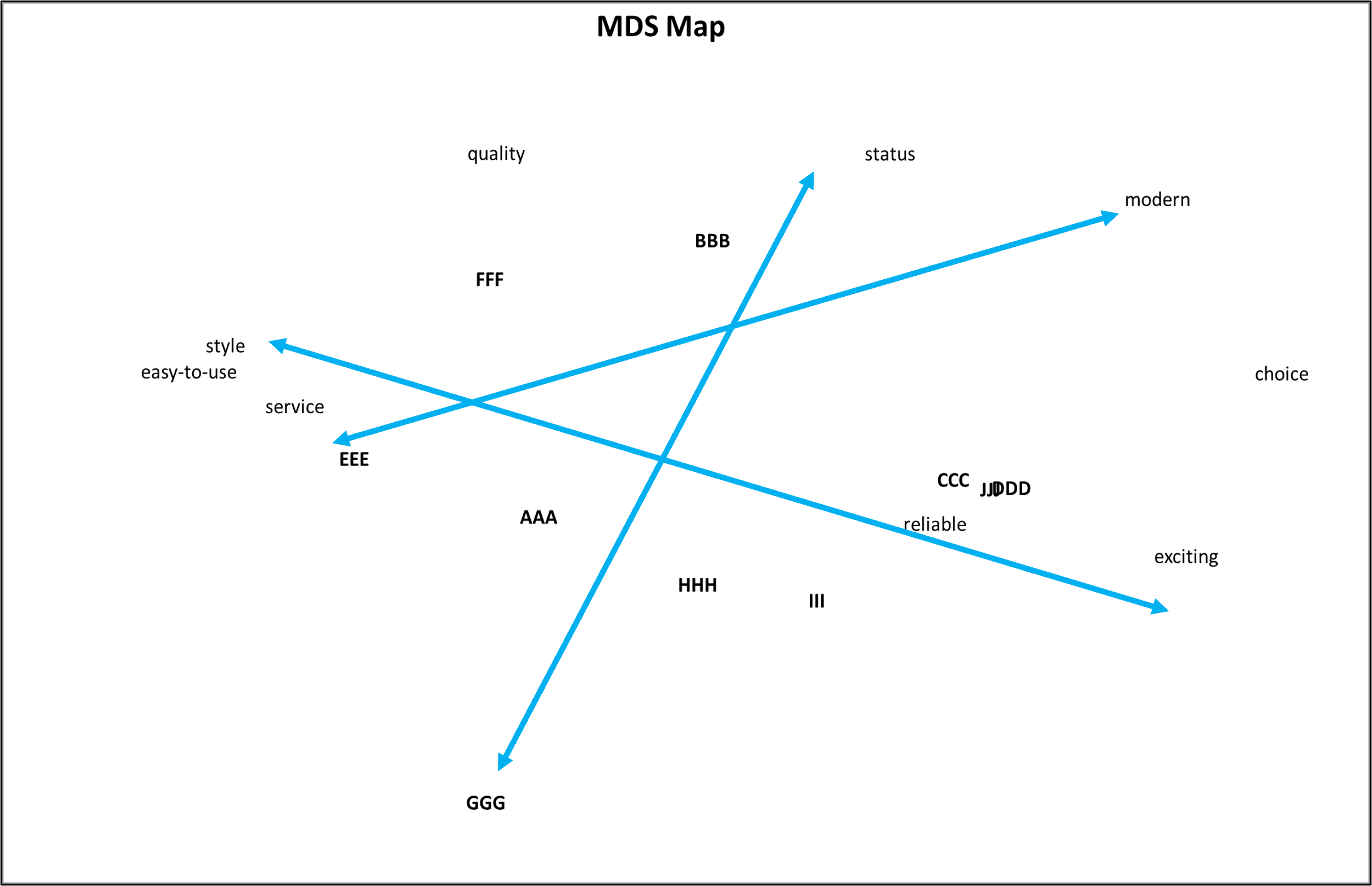
Let’s look at Brands AAA and EEE. As a reminder, they are relatively similar brands in their scores (see data set above). Both score higher on the first attributes and then their scores follow a downward stepping scale, but with Brand EEE having a more substantial drop in values.
When we look at these two brands on the CA map, we can see that the angles (lines from the center of the map to the brands) are virtually identical. This means they are quite similar in their attribute combination. But because Brand EEE is mapped further out (away from the center) this means that this brand is more distinctive (as suggested by the greater variability in the data).
Any attributes that have somewhat similar angles (lines from the center), such as “easy to use”, “style” and “service”, for these two brands, are strongly interconnected as a result.
And these brands have little or no association with other attributes, such as “reliable“, which sits at an angle of around 90 degrees away (comparing the lines from the origin).
Let’s now look at the MDS map, which maps distances (not angles). Here we can see that Brands AAA and EEE are considered quite similar because they are close together. They are also very close to “service”, “easy to use,” and “style”. The closer the brands are to these attributes, the stronger the association.
Key Difference 3 = How to Identify Key Aspects of the Brand’s Positioning
Difference number three is how we identify the key components of each brand’s positioning. In other words, where do we stand out? What are our strengths relative to competing brands?
To make sense of this difference, let’s focus on attributes: service, quality, and status. And let’s check in on our data to see which brands are most associated with these attributes, as follows:
- Brand BBB scored 9/9 on all attributes, so is obviously strong on these three attributes
- Brand FFF stands out for ALL three of them, and is weak on all other attributes
- Brand JJJ is a stand out for status
- Brand HHH is high for service
- And Brands AAA and EEE, although not 9/9, they both have good scores (association) with these attributes
OK, let’s have a look at how this data then gets mapped onto the two types of perceptual maps.
On the correspondence analysis map we can see that Brand BBB (being strong for ALL attributes, doesn’t stand out anywhere – as discussed above).
But Brand FFF (whose data has been constructed for this part of the example) is a long way from the origin (which means that it is a very distinctive brand) and is highly associated with quality, and also performs relatively well in terms of service and status.
But why is Brand HHH down the bottom and more aligned to reliable than to quality? It is because it is one of two brands only scoring 9/9 for reliable – so it has been more associated with that attribute because it is a “relative strength”.
Let’s now turn to the MDS map output for these three attributes. Here we can see that Brand HHH is close to reliable, but is also dragged toward service. And Brand BBB (unlike the CA map) is positioned closer to the less competitive attributes, and is somewhat in the middle of the map.
Key Difference 4 = How to Understand Brand Strengths
One of the key differences in these two approaches to brand mapping is how they highlight the strengths of a brand.
For instance, let’s take the example of Brand HHH, according to our data it scores a 9 on service, which is good but so do a few other brands – making it less distinctive.
But the when we compare it to other brands, we can see that it’s well above average in terms of reliability, which is its most distinctive attribute association.
But let’s now bring in Brand III for our analysis. While Brand III may not have the best overall scores in the market, it does have a couple of standout features.
Brand III has two 6s with the attributes of excitement and choice, which are reasonably good scores. On the other hand, its score for reliability is only a 3 – as compared to Brand HHH’s 9 for reliability.
On the CA map (below) – when we draw out the lines from the origin, we can that Brand III is connected with reliability, excitement and choice. But the brand maps relatively close to the origin, indicating that it is not all that distinction (relative to some of the other brands mapped).
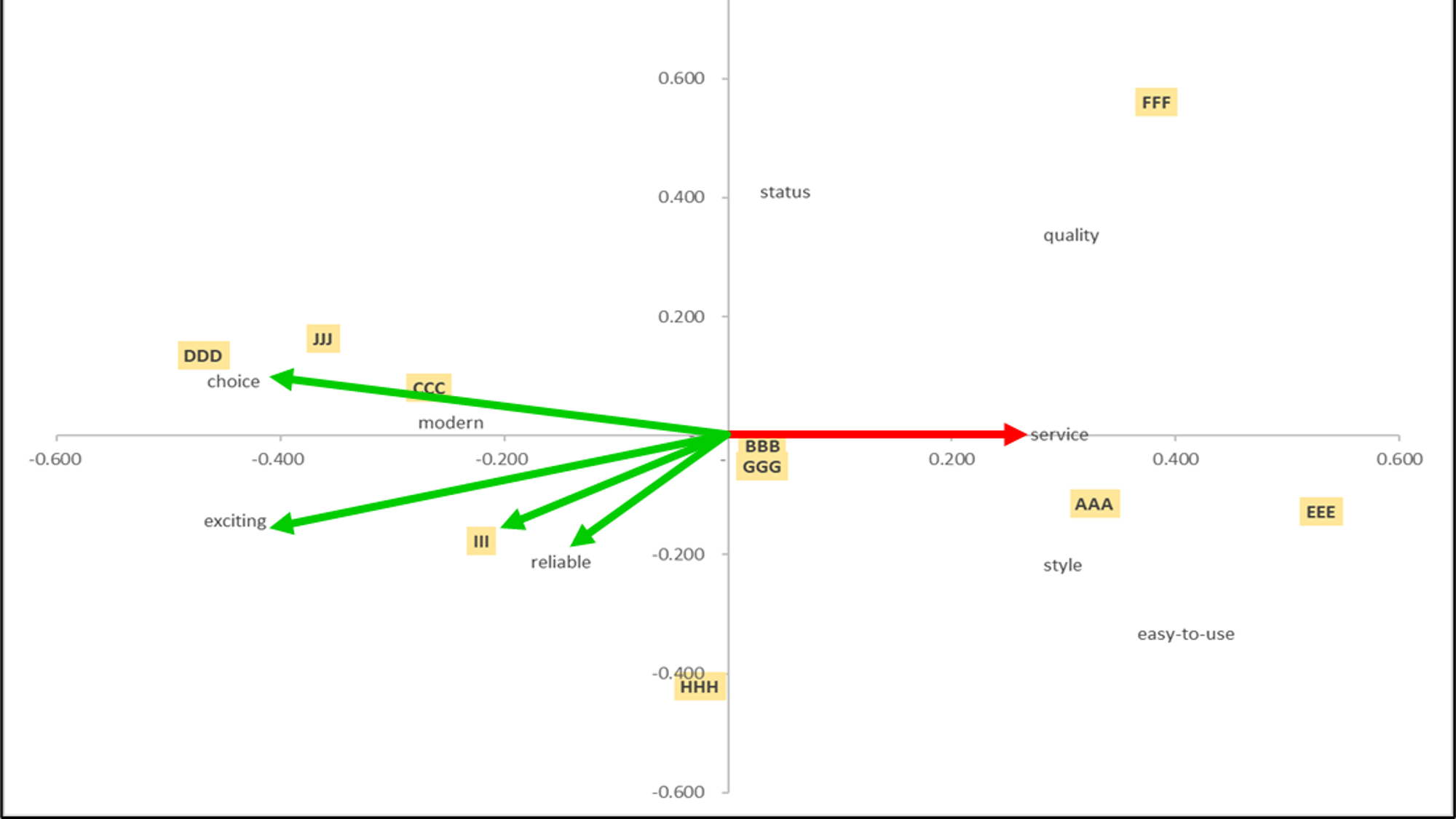
Let’s now look at the CA map (below), but this time focusing on Brand HHH only. Here we can see that this brand is also associated with reliable, but because it s further from the origin of the chart, it is considered on a more distinctive brand for this attribute.
And when we look at the MDS map – only considering Brand HHH (below) – we can connect the brand to its nearest attributes, namely reliability, then service and exciting (which it shares with other brands).
Key Difference 5 = Two-axis Chart versus No Axes at All
The correspondence analysis map output maps onto two dimensions, with clear axes on the chart. But there are NO axes on the MDS map output (for a reason as discussed below).
Correspondence analysis uses a set statistical structure, whish means that the same map will be reproduced consistently when using the same data set. This map (as discussed earlier) can be analyzed using angles and lines drawn from the origin out to brands and attributes.
But when using MDS maps, it’s up to the analysts or market researchers to label and identify the underlying dimensions of the map and the in-market relationships.
It is the critical role of the analyst when working with MDS maps to work out the logical connections and find the axes (that is, how consumers see the market and its brands) – as per this example below:
Key Difference 6 = Consistent vs Inconsistent Map Outputs
Difference number six is that correspondence analysis, on the same data, will reproduce exactly the same way and make the same map.
But with multi-dimensional scaling, because it’s trying to fit the data on a logical visual map, it will run slightly differently each time.
This is good and bad. It’s bad if you run a map that you like, but then you fail to save it and then cannot rerun it exactly as it was before. Bit… it’s good because it give you a slightly different view of the market – which can be quite helpful for additional market insights.
So when running MDS maps, you review a few different maps and, from your own viewpoint, choose the map/s that make more sense to the marketplace.
MDS vs CA Maps FAQs
What is the main difference between MDS mapping and Correspondence Analysis mapping?
MDS mapping and Correspondence Analysis mapping are both analytical and visual techniques for understanding brand positioning and brand distinctiveness.
The key differences between the two lie in how they compare differences between brands, attributes, and brand-to-attribute relationships. MDS looks at absolute differences and uses distance, while Correspondence Analysis examines relative differences and relies on angles.
In Correspondence Analysis, brands are mapped based on angles from the center, highlighting their distinctive strengths and weaknesses compared to the average brand.
In MDS, distances between brands and attributes are used to represent the relationships between them, clustering similar brands together.
Why does the Correspondence Analysis map have axes, while the MDS map does not?
Correspondence Analysis maps use a set statistical structure, which means the same map will consistently be reproduced when using the same data set.
In contrast, MDS maps require the analyst or market researcher to label and identify the underlying dimensions of the map and the in-market relationships. The axes in MDS maps are not fixed and need to be determined by the analyst.
How should brands be interpreted on Correspondence Analysis maps?
Brands on Correspondence Analysis maps should be interpreted using angles from the center. Similar angles indicate similar attribute combinations, with brands further from the center being more distinctive.
How should brands be interpreted on MDS maps?
Brands on MDS maps should be interpreted using distances between brands and attributes. Brands with similar attributes cluster together, while attributes closer to a brand indicate a stronger association in consumers’ minds.
Can MDS and correspondence analysis maps be used together for market analysis?
Yes, they can be used together to provide complementary insights into the relationships between brands and their attributes. Each method offers a different perspective on the data, and combining them can lead to a more comprehensive understanding of brand positioning and consumer perceptions.
Related Articles and Information
- Premium MDS Mapping Template
- How to Make a MDS Map from Start to Finish (VIDEO)
- Different Types of Perceptual Maps
- Statistics for Correspondence Analysis (External Site)
- Applied Multivariate Statistical Analysis (Book Chapter)