Contents
- 1 Don’t Have Excel 365 and Need a Perceptual Map???
- 2 The Instructional Videos
- 3 The Step-by-Step Instructions
- 3.1 Step 1 – Prepare your consumer image and perception data
- 3.2 Step 2 – Insert a Bubble Chart (Best chart style for a perceptual map)
- 3.3 Step 3 – Bring up the EDIT SERIES window
- 3.4 Step 4 – Select the data for Excel to use in making the perceptual map
- 3.5 Step 5 – Format the Axes of the Perceptual Map
- 3.6 Step 6 – Label the Axes of the Perceptual Map
- 3.7 Step 7 – Set Brand Names to the Center of the Circles
- 3.8 Check Out Multi-Map Template
- 4 Perceptual Maps 4 Marketing
Don’t Have Excel 365 and Need a Perceptual Map???
The Excel software in Microsoft Office 365 has enhanced functionality for making perceptual maps mush easier. This is primarily due to its ability to achieve the Brand Names as the data labels in the bubbles/circles on the perceptual map.
If you are running with an older version of Excel, and you want to make a perceptual map, then I would recommend the following actions:
- Use the free perceptual map maker Excel template – its quick and easy to use: Free Download of the Perceptual Map Template which is the easiest option OR
- Review the below videos and instructions on how to build a perceptual map with an earlier version of Excel.
NOTE: If you have access to Excel 365, the you should go to: How to Make a Perceptual Map in Excel 365
The Instructional Videos
Here are several instructional videos on how to make a two-axis perceptual map in an older/earlier versions of Excel. You can review them, or scroll down further for written and imaged-based instructions.
How to Make a Perceptual Map Using Excel 2016
How to Make a Perceptual Map Using Excel 2010 and 2013
How to Make a Perceptual Map Using the Free Excel Template
- Get the free template: Free Download of the Perceptual Map Template
The Step-by-Step Instructions
Step 1 – Prepare your consumer image and perception data
You need to have your list of brands/products and the two attributes that you have decided to use for the axis labels. In this example, we are preparing a sample perceptual map for the soft drink market. If you are stuck for ideas to use, this website has a list of possible product attribute ideas.
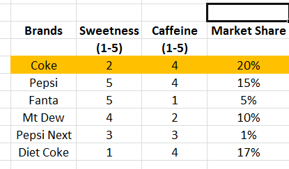
Please note that the third data column – market share – is optional. In the final perceptual map, the market share figure will make the circles on the map appear in different sizes relative to their market share. If you do not have this data, then all the bubbles on the perceptual map will be the same size.
Step 2 – Insert a Bubble Chart (Best chart style for a perceptual map)
On the Excel menu across the top of the spreadsheet, click INSERT, then OTHER CHARTS, and then select a BUBBLE chart. This is shown below – you can click the image to enlarge it.
You can also use a SCATTER chart format – but I have found the BUBBLE charts present better in business reports, as you have more formatting and color options.
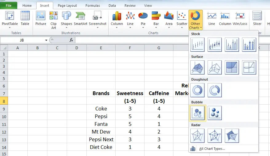
Click INSERT, then, OTHER CHARTS, then select a BUBBLE chart
Step 3 – Bring up the EDIT SERIES window
Because you have just inserted a chart, you should have a different menu across the top of Excel. If the CHART TOOLS menu is not showing, then click on your chart (which should be completely blank at this stage) and then click DESIGN, as shown in the image below.
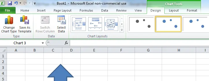
You then need to click on SELECT DATA and a pop-up window should appear, as shown in the next image.
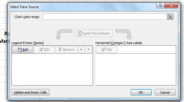
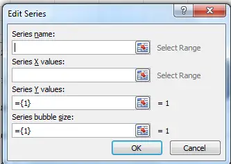
Then click ADD, which is on the left hand side in the middle and an EDIT SERIES window should pop-up. This is where we will tell Excel what data to use for the perceptual map. At this stage, you should see the following data/series entry window.
Step 4 – Select the data for Excel to use in making the perceptual map
Unfortunately, this is a line by line process and may take some time. Remember this is already set up in the Excel template on this site.
As you can see, there are four input boxes. When using a bubble chart to make a perceptual map, these four boxes correspond to:
- Series name = Brand or product name
- Series X values = First attribute score (horizontal axis)
- Series Y values = Second attribute score (vertical axis)
- Series bubble size = Relative market share
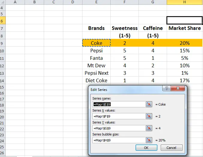
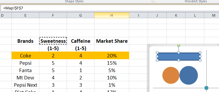
In the following image – click to enlarge – the first brand (Coke) has been set up. I use the mouse to first click on the red arrow next to the blank field and I then click on the appropriate spreadsheet cell. My worksheet has been named “map”, which is why =Map!$E$9 is shown in the ‘series name’ space – which simply means this worksheet and cell E9 (the word ‘Coke’).
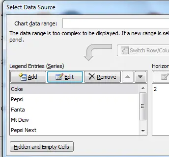
You the need to keep adding new legend entries (series) for all the brands and the attribute data. For this example, please see the following spreadsheet image showing all the series entered.
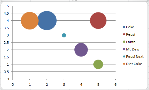
Once you hit OK, your initial perceptual map should appear, as per the following example.
Step 5 – Format the Axes of the Perceptual Map
For most perceptual maps we don’t want all the lines and numbers listed on the map. Instead we simply want to make a big plus sign in the middle of the perceptual map.
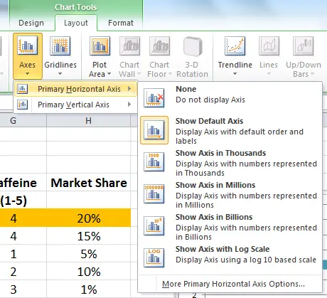
To format the chart in this manner, we need to click on LAYOUT, then AXES, and then ‘primary horizontal axis’, and finally ‘more primary horizontal axis options’ right at the bottom – as shown in the following image.
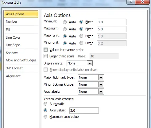
This menu should open (as shown below). Please note the changes that have been made.
- The minimum has been set to 0 (1 below the actual minimum)
- The maximum has been set to 6 (1 above the actual maximum)
- Major/minor tick mark type has been set to none
- Axes labels has been set to none
- And, at the bottom, the vertical axis crosses at 3.
Please note, for this example I am using a 1 to 5 scale for the attribute values, hence I have the chart axes running from 0 to 6 (to provide sufficient space). If you use a wider scale, say 1 to 9, you will need to adjust the maximum to 10, and so on. And the vertical axis cross should be the median/mid-point of the scale (if 1 to 9 scale is used, then the median/mid-point is 5).
You then need to repeat the above step for the VERTICAL axis.
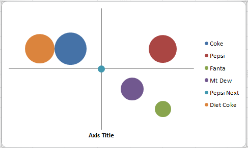
Once you have set BOTH the horizontal and vertical axis options, as per the above instructions, then your perceptual map (at this stage) should look like the following image. We are almost there, but we need to add the axis labels and you have the option of changing colors and putting the labels in the middle of the circles.
Step 6 – Label the Axes of the Perceptual Map
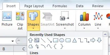
Let’s first remove the ‘axis title’ box at the bottom by simply clicking on it and deleting it. You then need to click on INSERT and then click on SHAPES and select a rectangle (not a text box). This is shown in the next image.
Once you select the rectangle (the 5th shape in the above menu image), then click on the function box at the top and type ‘=’ and then click on the name of the attribute on the Excel spreadsheet. This is shown in the next image. You will note that in the function (fx) box that the ‘sweetness’ cell is highlighted.
You should then repeat this step for the 2nd attribute. Then your perceptual map should look like the next image (you may need to move the boxes into their preferred positions).
Step 7 – Set Brand Names to the Center of the Circles
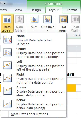
IF you want to move the brand names to the center of the circles, instead of being listed at the side,then first delete the side labels by clicking on the brand list and then hit delete. You then you need to bring up the charts menu (click on the chart) and then click on LAYOUT and then DATA LABELS and then click on MORE DATA LABEL OPTIONS (listed right at the bottom of the menu – see image below).
Once you have done this, the following new window should pop-up. We need to do two things on this ‘format data labels’ menu. First we need to reset ‘label contains’ from the default setting of the Y Value to Series Name. And then you can decide where the ‘label position’ will be (I would suggest center).
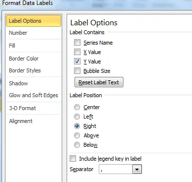
The above is the default – unclick Y value and select Series Name instead.
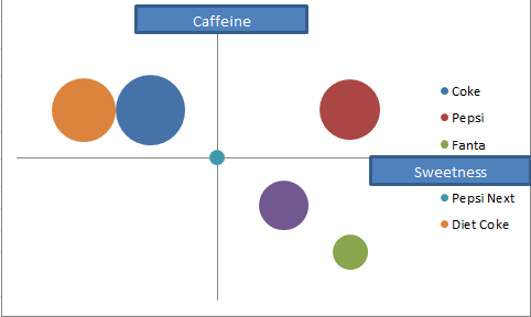
After selecting Series Name your perceptual map should now look like the following image.
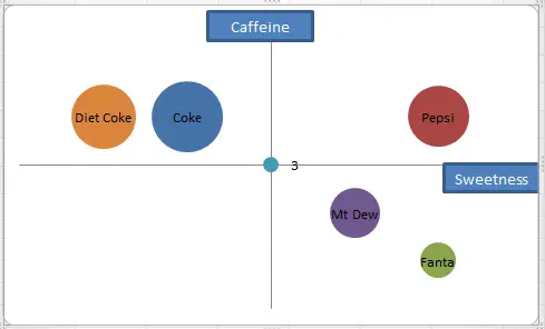
So here is your perceptual map – you can add a heading on the map (in the same way that we did the axis labels) or you can add a heading in your marketing report. However, as mentioned at the start on these instructions, I have already set up an Excel template that is easy-to-use and ready-to-go.
Further Information
- Perceptual Maps: Best Practice
- What is a Perceptual Map?
- Top 12 Tips for Analyzing Perceptual Maps
- Why Use Perceptual Maps?
- Benefits of Perceptual Maps
- Limitations of Perceptual Maps
Check Out Multi-Map Template
If you need to construct more than one perceptual map – which is the most common scenario – then you might be better off with the Fast Perceptual Map Maker. This template allows the input of up to 25 attributes and up to 25 brands, which then enables you to review up to 300 perceptual maps amazingly fast. A great analysis tool.
Perceptual Maps 4 Marketing
- The Home of the Free Perceptual Map Excel Template
- Downloaded over 100,000 times since 2013
- Always free, always will be
- Ideal tool for marketing students, analysts, and practitioners