Contents
Price and Quality Do NOT Go Together on any Perceptual Map
Or Why the Too Common Price/Quality Perceptual Map is such a Poor Map!!!
Perceptual maps are a powerful tool in the marketer’s toolkit – no doubt about that. These maps help us understand how consumers perceive different brands in a given market.
They are ideal for understanding the market and generating market insights – provided they are used correctly – please see my article on Perceptual Maps: Best Practice.
But not all perceptual maps are valuable and some can be downright dangerous. In this article I will explore why the common price/quality perceptual map should NEVER be used by any marketer – so please don’t use it.
Please Scroll Down for the Full Article, or Review this Video…
So What’s Wrong with the Price/Quality Perceptual Map
Well, let’s start up taking a look at it. They ALL look like this:
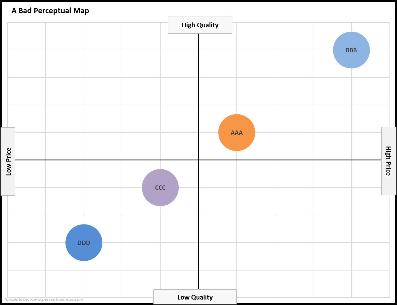
And what do you notice? That’s right, all the brands fall into a virtual straight line on the perceptual. It happens every time – go figure.
For some unknown and illogical reason, this price/quality perceptual map is often used as an example on the internet and has also been used in some marketing textbooks. I am disappointed that this type of map is repeatedly shown, as it under plays that value that perceptual maps can have in marketing analytics, by serving up a map that contains no valuable information at all.
And as we can see, this above map shows us that there is a strong positive correlation between price and quality. Big deal. We already knew that BEFORE we made the map. There are certainly no market insights here!
Why does this happen? This happens because consumers connect the concept of product quality and price. If you walk into a store and see to similar products that are priced quite differently, you automatically assume that the high-priced products are of high quality.
This is shown on the above map – what additional information that we gain from a marketing perspective? Perceptual maps be a very powerful tool if used effectively, but we want to map consumer perceptions, not aspect of the marketing mix such as price.
Watch Out for Any Correlations on a Perceptual Map
While a high/low price and high/low quality perceptual amount will always generate a strong positive correlation, we also need to be careful with any other perceptual maps that indicate correlation as well.
And the correlation does not need to be a positive one, it can be a negative correlation as well. In either case, in the consumer’s minds, they perceive a strong relationship between the two attributes falling on the map.
In other words, your perceptual map that has correlated data is essentially mapping the SAME attribute twice – because the consumer considers it pretty much the same. And why we may perceive a slight technical difference between the two attributes, that does not matter because we are interested in the consumer’s viewpoint, not ours.
Therefore, whenever you have a correlated map – drop one of the attributes and introduce a new attribute. This will give you a better understanding of the market and bring something new to the map.
What Makes a Useful Perceptual Map
A useful perceptual map should measure perceptions, not marketing mix decisions or technical or reality differences (please see my article on perception is reality).
To create a useful perceptual map, we need to identify the attributes that are most important to consumers in the market. There are 100’s of possible product and brand attributes that we can choose from – please see these two articles that provide a combined list of around 250 attribute ideas:
Next Steps
I would encourage you to have a look around this website and garner more information around perceptual maps – please see the list of suggestions below – and why you’re here, please download the free Excel template for producing perceptual maps quickly and easily – a necessary tool for every marketer’s toolkit!
- Perceptual Maps: Best Practice
- Top 12 Tips for Using Perceptual Maps
- Using the Perceptual Map Template
- The Perceptual Process
- Understanding Product Positioning